The Digital Front Door to Compassionate Care
The journey of choosing a care home is rarely straightforward. It’s a decision often wrapped in emotion—concern, uncertainty, even guilt. In this climate, the care home website has become far more than a digital placeholder. It’s the virtual front door—a critical trust-building tool, a source of reassurance, and often the deciding factor in whether a family makes contact or clicks away.
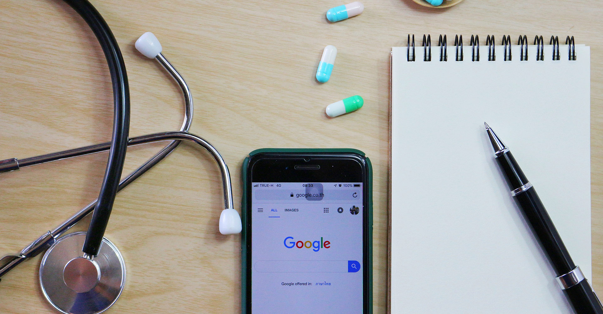
With 75% of care decisions starting with an online search, having a website that builds trust, demonstrates competence, and converts visitors into enquiries is business-critical. So, what does a high-performing care home website look like? And how do you create one that delivers real results?
Let’s explore the essential ingredients of care home web design that converts.
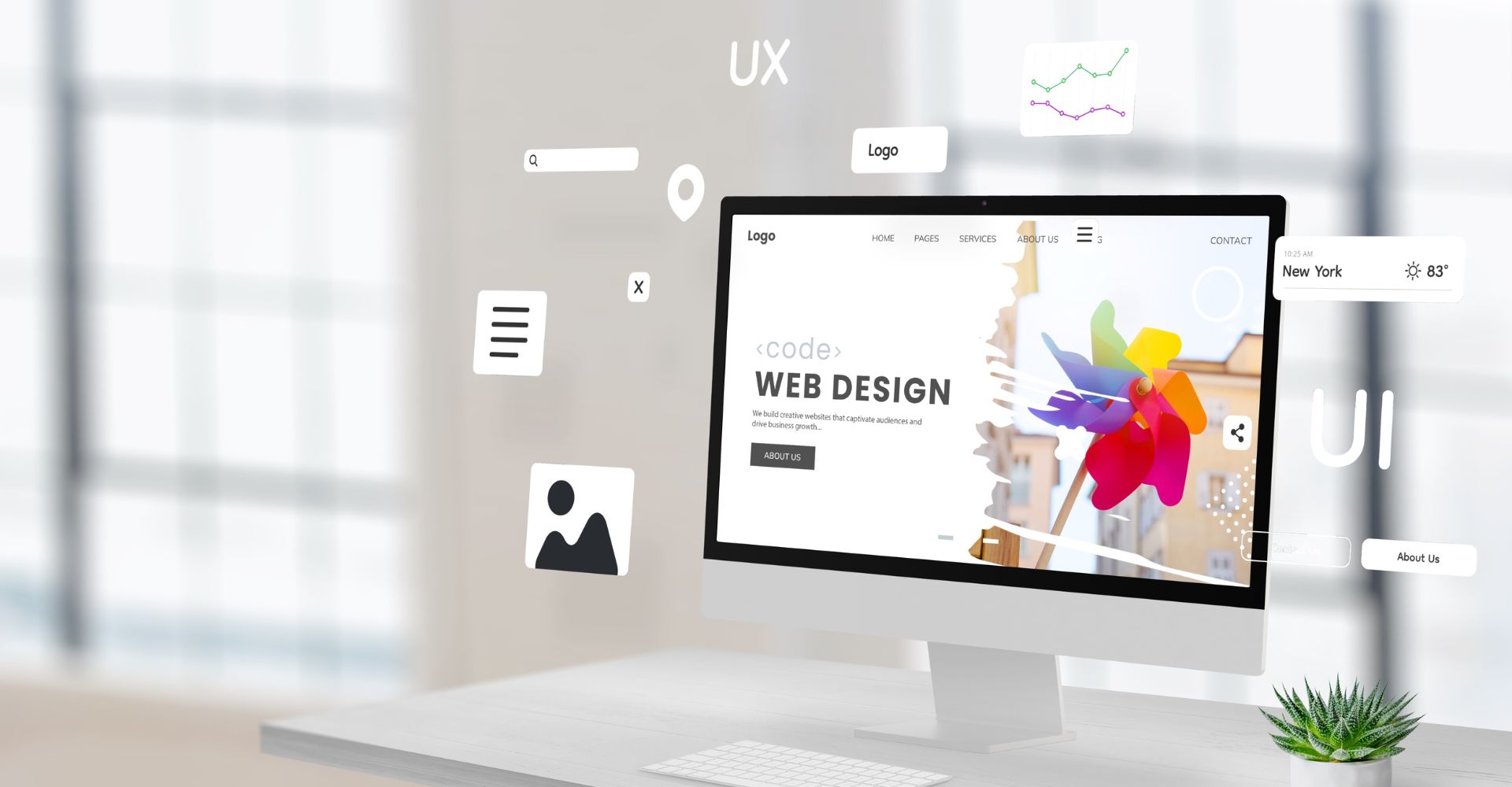
Why Website Design Matters in the Care Sector
Care home websites must do three key jobs:
-
Inform: Provide clear, comprehensive, and easily accessible information.
-
Reassure: Build trust, reduce anxiety, and reflect a caring, professional environment.
-
Convert: Make it easy for users to take the next step—book a tour, make an enquiry, or download a brochure.
Fail to meet any one of these goals and you risk losing potential residents and their families at a crucial stage.
Understand Your Audience: Dual Decision-Makers
Care home websites often serve two primary audiences:
-
Adult children (age 40–60) – Frequently the main decision-makers, they seek efficiency, detailed information, care quality indicators (like CQC ratings), and clear pricing structures.
-
Older adults (65+) – Particularly relevant for independent living settings, they want reassurance, lifestyle content, and intuitive navigation.
You’re also indirectly communicating with professionals like GPs and social workers who may influence referrals. A professional, transparent site helps support their confidence in your home.
Design takeaway: Create layered content pathways. Cater to quick-access needs with summaries and CTAs, while also providing deeper detail for thorough researchers.
Build Trust From the First Click
Trust is the foundation of any care relationship. Your website must reflect this at every level:
-
Professional Design: Modern, clean layouts signal competence. An outdated site can make even the best care look second-rate.
-
Transparency: Be upfront about services, staffing, pricing, CQC ratings, and your care philosophy.
-
Social Proof: Feature authentic testimonials, awards, and Carehome.co.uk reviews.
-
Meet the Team: Put faces to names. Bios of your staff help humanise the brand.
-
Security & Compliance: Use HTTPS, highlight GDPR compliance, and explain how you protect user data.
Prioritise Accessibility for All Users
Accessibility isn’t just ethical—it’s essential. Your users may include older adults or individuals with cognitive or visual impairments.
Follow these best practices:
-
Clear sans-serif fonts (like Arial or Verdana), at a readable size
-
High colour contrast between text and backgrounds
-
Keyboard navigability and screen reader support
-
Alt text for images and transcripts for video
-
Fully responsive design for mobile and tablet users
Accessible websites perform better in search engines and reduce bounce rates.
Design With Empathy
Your tone, imagery, and content should all communicate genuine care.
-
Use warm, reassuring language—avoid jargon and speak like a trusted advisor.
-
Show real imagery—authentic photos of residents, staff, and facilities foster emotional connection.
-
Include virtual tours and videos—ideal for families researching from afar or unable to visit easily.
Empathy should shape your entire content strategy. From the homepage to the FAQs, speak to your audience’s emotions and answer the questions they’re too overwhelmed to ask.
Simplify the User Journey
Even the best content is wasted if it’s hard to find.
-
Navigation: Use clear, consistent menus with logical grouping.
-
Homepage priorities: Display contact details, key CTAs, and USPs above the fold.
-
Clear CTAs: “Book a Visit”, “Download a Brochure”, “Check Availability” should be obvious and repeated where relevant.
-
Search bar: Especially important for multi-location operators.
-
Breadcrumbs and internal links: Help users navigate complex information structures with ease.
Leverage Colour Psychology and Design Hierarchy
Colours influence emotion and perception. For care settings:
-
Blue = trust and calm
-
Green = health and wellbeing
-
Neutrals = clarity and cleanliness
Avoid overly harsh tones or too much red, which can evoke stress or danger.
Use clear headings, bullet points, and white space to guide attention and make scanning effortless.
Craft High-Converting Calls-to-Action (CTAs)
CTAs must be easy to spot, understand, and act on.
Best practice tips:
-
Action-oriented copy: e.g. “Book a Free Tour” or “Request Pricing”
-
Visibility: Use bold colours with high contrast and surrounding whitespace
-
Placement: Feature CTAs at logical touchpoints throughout the site
-
Variety: Offer low- and high-commitment options to suit different stages of the user journey
A/B test variations to see what converts best over time.
The Emotio Advantage: Strategy Meets Design
With decades of experience in branding and digital marketing—and specific expertise in the care sector—Emotio Design Group helps care homes create websites that connect and convert.
Their ethos, “Results by design”, blends creative flair with data-backed decision-making. Emotio doesn’t just build pretty websites; they craft strategic assets that drive enquiries and build trust—two things that matter deeply in this industry.
From accessibility and branding to CRM integration and SEO strategy, Emotio delivers the complete package for care providers who take their digital presence seriously.
Results You Can Measure
Evidence shows that well-designed care websites consistently:
-
Increase time spent on site
-
Reduce bounce rates
-
Drive more qualified enquiries
-
Improve search engine rankings
-
Enhance brand trust and recall
With Google now prioritising UX signals in rankings, great design isn’t just a nice-to-have—it’s a competitive advantage.
Conclusion: Turn Your Website Into Your Strongest Sales Tool
Your website is not a static brochure—it’s a dynamic opportunity to reflect your values, connect with families, and increase enquiries.
By combining user-centred design, emotional intelligence, and clear conversion strategies, care homes can elevate their digital presence from functional to exceptional.
If your current site isn’t delivering, it may be time to revisit your strategy—and Emotio is well-placed to help you do just that.